 MENU
MENUTecplot Visualization & Analysis
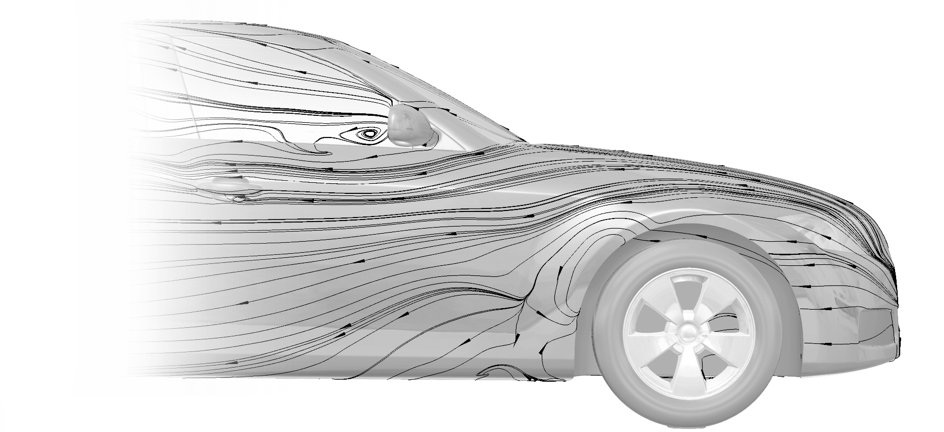
Tecplot post-processing tools for CFD, other simulations and experimental data help you discover, analyze and communicate results. Tecplot software differs from other visualization tools in that it is easy to learn and use, offers broader capabilities, and produces better-quality images and output.
News
Events
WEBINAR RECORDING
A Look at Tecplot 360 2023 R2 and What’s Coming in 2024: Learn about what’s new in Tecplot 360 and get a sneak peek of what’s coming in 2024.
Watch Now
WEBINAR RECORDING
Parallel Post on HPC Made Easy with FieldView 2023: Check out all of the new features, fixes, and performance improvements that FieldView 2023 offers.
Watch Now
Follow Us


What Our Customers Are Saying
"I really liked the demonstration of how to setup the FieldView parallel and client-server features. It reduces the effort of learning new things. This was like sitting down with a colleague showing you how to do something."
CFD engineer/aerospace engine designer
Tecplot Visualization and Analysis
 Tecplot, Inc. is the leading post-processing software developer in CFD data visualization. We believe visual analysis is the key to unlocking information hidden in complex data, leading to world-changing discoveries and innovation. Not only do we empower engineers and scientists to visualize, analyze, and understand information in simulation and test data results, but through our high-resolution images and animations, we help them clearly communicate their results to stakeholders.
Tecplot software differs from other visualization tools in that it is easy to learn and use, offers broader capabilities, and produces better-quality images and output.
- Tecplot 360 – A suite of visualization and analysis tools that can handle large data sets, automate workflows, and visualize parametric results.
- FieldView – High-end postprocessing, with realistic images that help you understand your data.
- Tecplot RS – Specifically designed to streamline oil & gas reservoir simulation visualization and analysis.
More than 60,000 technical professionals around the world use Tecplot visualization software. Customer applications span many industries including aerospace, automotive, defense, geoscience, biomedical, chemical, energy, environmental, industrial/machinery, marine, oil & gas, semiconductor/electronics (and more).For the latest from thought leaders at Tecplot, read the Tecplot Blog.
Tecplot, Inc. is an operating company of Toronto-based Constellation Software, Inc. (CSI). CSI is a public company listed on the Toronto Stock Exchange (TSX:CSU). It acquires, manages and builds software businesses that provide mission-critical solutions in specific vertical markets.